

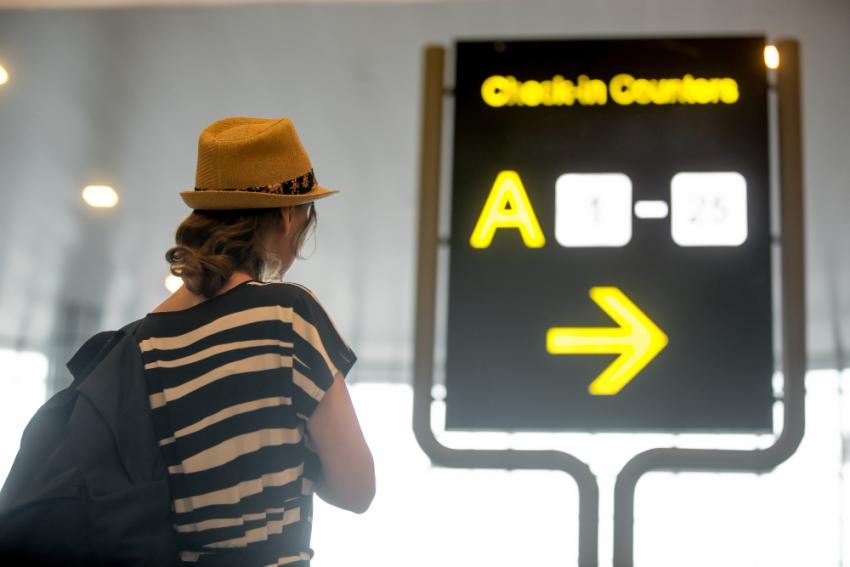
A banner has about three seconds. Maybe less if the person looking at it is behind the wheel. That's all you get, and it's why so many banners (even expensive ones) just melt into the background.
I'll say upfront that none of what follows is clever. It's mostly common sense that people skip when they're rushing to get something printed before an event. But skipping it is exactly how you end up with a big, costly piece of vinyl that nobody reads.
One message. Just one.
Ask a business owner what should go on their banner and the list gets long fast. Logo, services, two phone numbers, website, Instagram, a "we also do" line, a photo of the shop. Then they wonder why it looks busy.
Pick the thing you most want people to take away and build around that. "Sale ends Friday." "Now open in Business Bay." Whatever it is. Everything else is a distraction, and your website can handle the details.
Quick check I like: hand someone the design, take it back after three seconds, ask what it was about. A blank look means cut something.
Size up your text, then size it up again
What looks huge on your laptop looks small once it's hung up high. Always. Sign people usually work from a rough rule of one inch of lettering for every ten feet of distance, and drivers need more than that since they're moving.
Fonts: go thick and simple. Skinny, swirly fonts look great in a wedding invite and awful on a banner. Two typefaces max.
Can you read it from across the road?
Contrast is where a lot of nice-looking designs quietly fall over. Light grey on white. Gold on cream. Red on a dark green. Fine on a monitor, gone from thirty metres, and even more gone under the Dubai sun at 1pm.
Dark on light or light on dark, and make it obvious. Text over a photo? Put a colour block behind it, or darken the picture. Or try the lazy test: turn the design greyscale. If the headline still pops, good. If it sinks, you've got a contrast problem and no amount of colour will hide it.
Fewer pictures, better pictures
One strong image gives the eye somewhere to land. Five small ones give it a headache. Use a product shot, a person, or a bold simple graphic, and let there be some empty space around it. Empty space isn't wasted space. It's what makes the rest stand out.
And check the file quality before you send anything. A logo grabbed from a website at 300px wide will look chewed up stretched across two metres. Ask whoever made your logo for the vector file. Most designers have one sitting somewhere.
Colours won't match your screen
Screens use light, printers use ink, and the two don't agree on certain colours. Neon greens and bright electric blues are the usual victims. They print flatter than you expected, and then you're annoyed at the printer when it wasn't really their fault.
Ask for a CMYK file, pass on your Pantone numbers if you've got them, and request a proof if the colour is important. A banner in the wrong red when it's meant to match your signboard is a real pain.
Where it's going matters
This one's specific to the UAE. Sun, heat, dust, wind. A banner hung outside takes a beating, and cheap vinyl with ordinary ink can look tired surprisingly quickly.
When you're talking to custom printing services Dubai firms offer, ask a few direct questions. Is the ink UV-resistant? How long should the colours last outdoors? Is mesh better here? (On windy spots, often yes, because the air passes through instead of pulling at the fixings.) And what finish are they using? Glossy can bounce so much sunlight back that people can't read the thing from certain angles, so matte is usually the safer choice outside.
Also, depending on the location you might need approval to put it up. Your landlord or printer will normally know, so find out before the banner exists, not after.
Arabic and English together
Plenty of banners here use both languages. Plan it from the beginning. If you design in English first and squeeze the Arabic in afterwards, it tends to look off, because the scripts read in opposite directions and have different visual weight.
Settle which language leads. Make both large enough. Get a native Arabic speaker to read the final file. Copying Arabic between programs can break the letters apart, and people spot it straight away.
Tell people what to do
Say the banner does its job and someone notices it. Then what? If there's no next step, all that attention goes nowhere. So give them one: a phone number, an address, a short web link. Not four of them.
QR codes work if people can really scan them. Make it big, give it space, and test it on two or three phones. If your banner's going to be fifteen metres up, a QR code is pointless because nobody's getting close enough.
The boring file stuff
Lots of reprints come from file mistakes, not bad design. Add bleed, which is just a few extra centimetres of artwork past the edge so the trim doesn't clip anything. Keep key text away from the borders, especially if there'll be eyelets or a pole pocket. Outline your fonts. Export at full size or a clean fraction of it. If you're unsure, ask your printer. Most will look over your file before they print it.
Before you approve it
Print it on A4 and stick it on a wall at the other end of the room. Spelling mistakes and squashed text jump out from there almost instantly.
Then have a proper conversation with the printer. The better custom printing services in Dubai will do more than run your file. They'll warn you about problems and suggest materials for your site, because they've watched banners succeed and fail across the city. Listen to them. A reprint costs a lot more than a five-minute chat.
So, short version: keep it simple, make it big, think about the sun, think about both languages, and give people one thing to do.